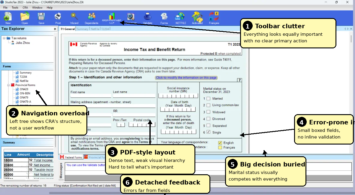
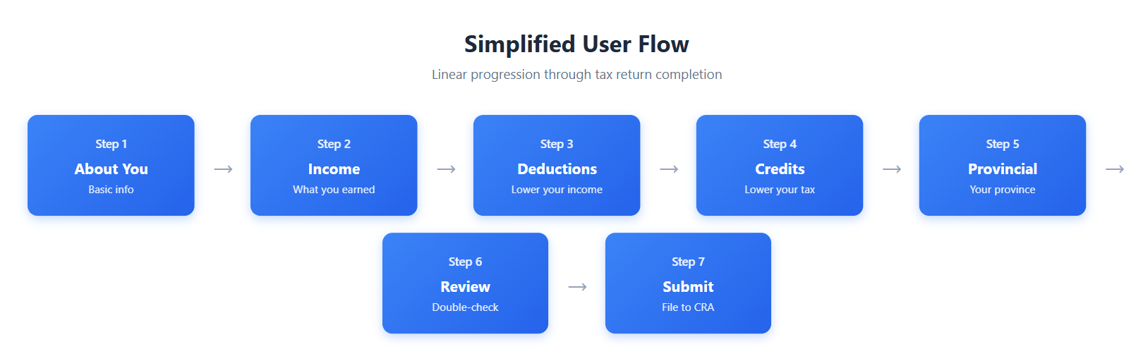
making tax filing less painful with a modern interface that actually makes sense
StudioTax looked like it was designed in the 90s and threw way too much at users at once. the interface used technical jargon nobody understood, had overwhelming menus everywhere, and confusing navigation that made filing taxes super stressful.
the toolbar had 15+ icons crammed together, endless menu options, and super dense forms. everything was visible at the same time which completely overwhelmed users
the menu used cryptic government form codes like T2204 and ON428 instead of plain language. nobody thinks in terms of form numbers, they just want to enter their income or claim deductions
there was no inline validation at all. users would fill out entire sections and errors would only show up after they hit submit, making it super hard to figure out which field had the problem
input fields were tiny and hard to click on. there was no formatting help for things like SIN numbers or currency amounts, so people made tons of mistakes
Goal: create a modern, intuitive interface that guides users through the process step by step. give them instant feedback so they know they're doing it right, and use plain language instead of confusing tax jargon
i talked to 15 people who actually use tax software and watched them try to navigate through StudioTax. here's what i found:
key takeaway: everyone wanted some kind of progress tracking so they knew how much was left. the outdated design also made people really nervous about entering their personal tax info
the first thing i tackled was the navigation. i reorganized everything around actual user tasks instead of those cryptic form codes. managed to simplify it from 12 confusing steps down to just 7 clear ones
i started with rough wireframes to test out different layouts. tested them with users, gathered feedback, made changes based on what i learned. then i built high-fidelity prototypes in Figma so everyone could actually click through and experience how it would work
early-stage layout explorations
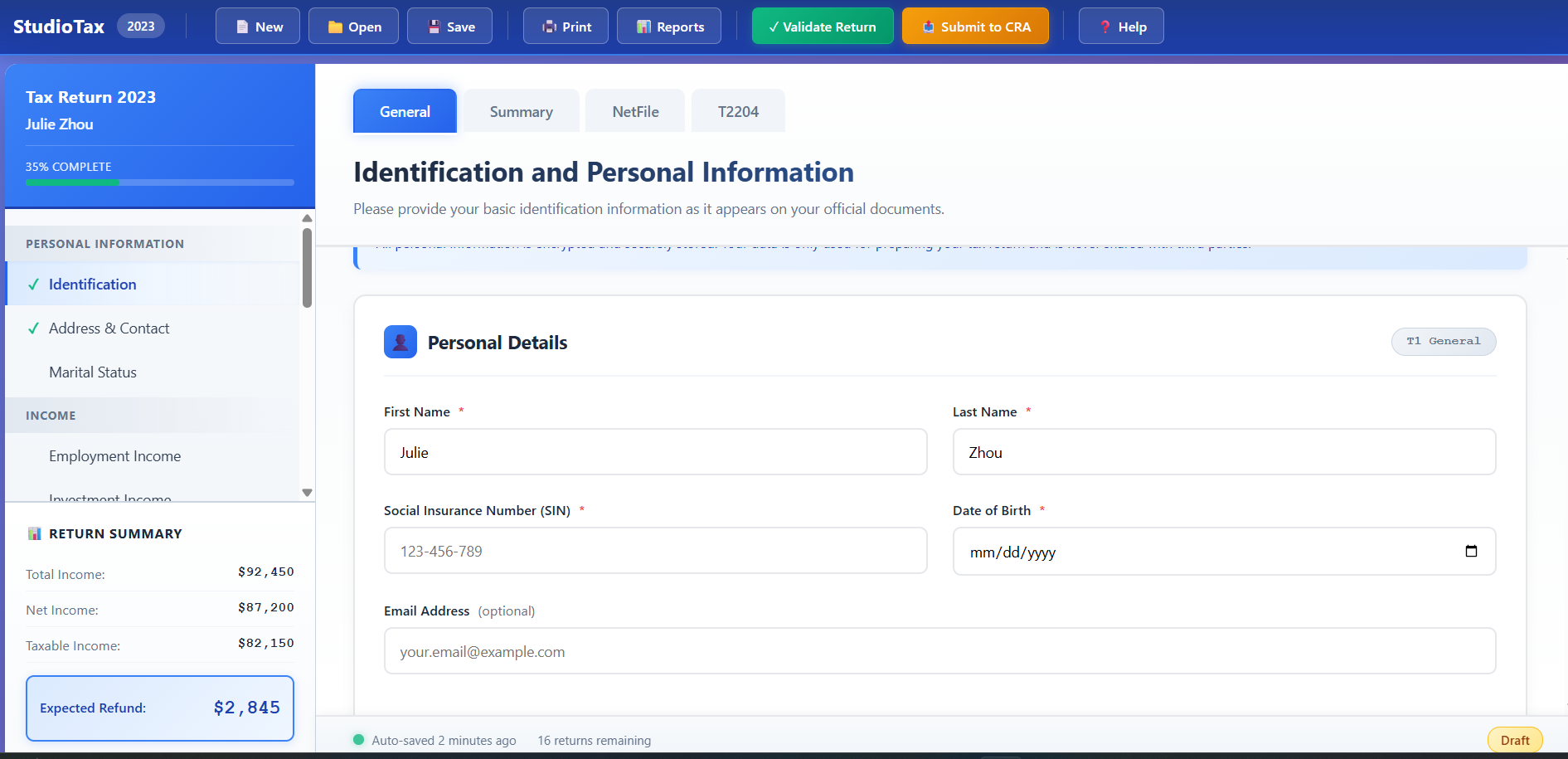
Visual progress bar shows exactly where you are
Tooltips explain terms right where you need them
Only shows relevant information at each step
Instant feedback with smart suggestions
Works seamlessly on any device
Transparent data protection messaging
showing less information at once made a huge difference. when you split complex tasks into smaller, manageable steps, people feel way more confident and in control of what they're doing
inline tooltips ended up being everyone's favorite feature. instead of making people read through big tutorials upfront, putting help right next to the confusing stuff actually worked. people used them and said it made everything way clearer
user testing caught so many assumptions i made that were totally wrong. things that seemed super obvious to me completely confused actual users. testing early and often saved me from making those mistakes in the final design