Case Study
BMO Banking App Redesign
What happens when you actually show people their money
What happens when you actually show people their money
Role: UX Designer (Personal Project)
Duration: 3 weeks
Tools: Figma, user research, competitive analysis
As a BMO customer, I've noticed the app covers the basics - it shows balances and lists transactions. But it doesn't go much further than that. Other banking apps provide spending breakdowns, alert users to unusual activity, and offer insights to help manage finances. BMO is missing these features, so I decided to explore what a more comprehensive version could look like.
The app has a 3.2 star rating in the App Store. The reviews are pretty consistent - people complain about the app being too basic, lacking spending breakdowns, and missing features that other banks have.
Since I'm already a customer dealing with these limitations, it made sense to tackle this for my portfolio. The app handles basic banking fine, but there's clear room for improvement in helping people actually manage their money.
BMO's app isn't terrible - it shows your balance once you tap into Accounts. But that's pretty much all it does. It's super barebones. No spending insights, no monthly comparisons, no warnings when you're spending more than usual. And the home screen? Just promotions and "what's new" stuff that nobody really checks.
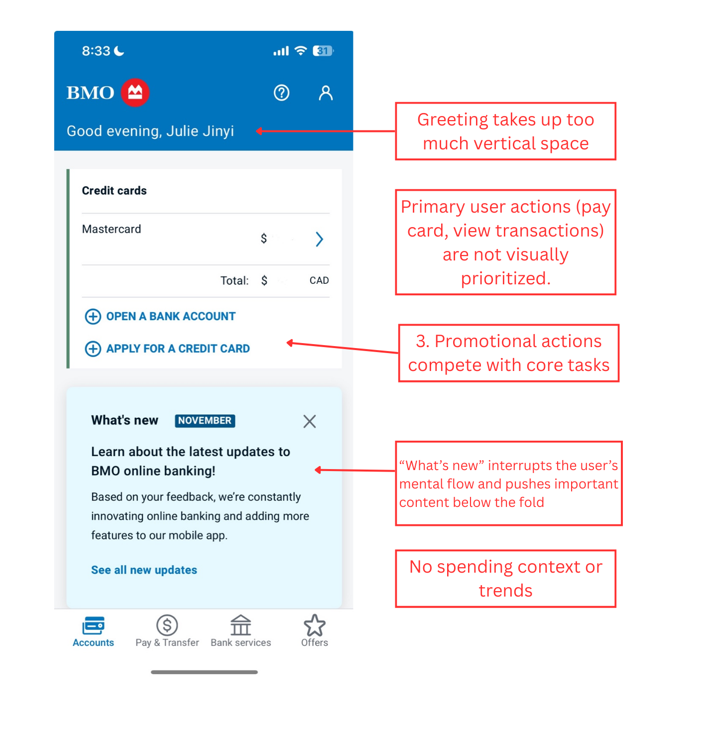
Key problem areas in the current BMO mobile banking app
I observed 8 BMO customers (friends, family, and classmates) using the app to complete common tasks like checking their balance and paying bills. The goal was to understand their natural behavior and identify pain points.
Key finding: 7 out of 8 participants skipped the home screen entirely and went directly to the Accounts tab. When asked why, they explained the home screen didn't show them anything useful.
I analyzed 200+ recent reviews from the App Store and Google Play to identify common user frustrations and feature requests.
Key finding: Users consistently requested spending insights and category breakdowns. Common phrases included "too basic compared to other banks" and "wish I could see where my money goes."
I tested banking apps from Chase, TD, RBC, Scotiabank, and fintech apps like Mint and Wealthsimple to understand what features users expect from modern banking apps.
Key finding: Apps with higher ratings (4+ stars) consistently display account balances on the home screen and include spending insights with category breakdowns. These features have become table stakes.
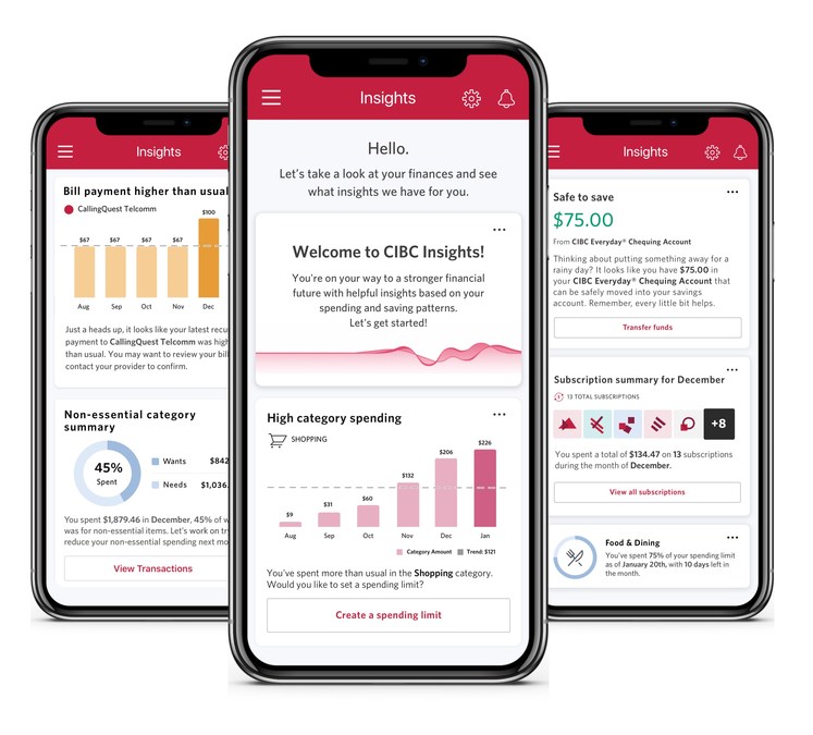
CIBC's AI-driven insights feature showing personalized spending and saving data (Feb 2021) - an example of the type of spending insights competitors offer that BMO lacks
I evaluated the app against Nielsen's 10 usability heuristics to identify specific UX violations.
Key finding: The app struggled with visibility of system status (important info buried), efficiency of use (multiple taps for common tasks), and helping users recognize and diagnose problems (no spending alerts or insights).
The research revealed a clear pattern: when people open their banking app, they're looking for specific information:
• Their current balance
• Recent transactions
• Ability to transfer money
• Understanding of their spending habits
The solution became obvious - surface this information immediately on the home screen instead of requiring navigation.
Open the app, see your money. Zero taps. Both checking and credit card balances are right there on the home screen where they should be.
Send money, pay bills, deposit checks - all one tap away. No more hunting through menus for the stuff you do every week.
The app now tells you when you're spending more than usual. Like "hey, you spent 23% more this month" - no spreadsheets required.
See your last few purchases right on the home screen. Perfect for that "wait, did I already pay for parking?" moment.
The most requested feature from users was spending insights. Here's a data-rich prototype showing how BMO could help users understand and manage their finances with visual analytics, trend analysis, and actionable alerts.
Donut charts, line graphs, bar charts, and circular progress indicators provide different ways to visualize spending patterns.
Proactive notifications when spending exceeds averages, helping users stay aware before overspending becomes a problem.
Compare current month against previous months and yearly averages to identify spending patterns over time.
Visual progress bars and milestone tracking for savings goals with monthly contribution history.
Your account balance gets a big 36px font and these nice gradient cards so they're the first thing your eye goes to. Everything else - spending insights, transactions - sits below in smaller cards.
Blue gradient for checking (feels trustworthy), dark gradient for credit cards (looks premium), red when you're overspending (uh oh), and green for income (yay money).
Kicked out the "Offers" tab (nobody uses it) and added a proper "Home" tab. Changed "Bank services" to just "More" because who knows what "Bank services" means anyway. Transfer money got its own spot since people actually use that.
Home screen shows your top 2 accounts and last 2 transactions. If you want more, there's a "View All" button. Keeps things clean without hiding important info.
During interviews, people literally said "I just want to see my balance." I almost thought it was too obvious to be the solution. But that's the point - good UX often means doing the simple, obvious thing that users are asking for.
While designing this, I had to think about business goals too. Banks need to promote products. The challenge isn't ignoring business needs - it's finding ways to serve users first while still meeting those goals. That's why I moved offers to a dedicated section instead of deleting them entirely.
My first mockup had spending insights at the very top because I thought it was interesting. But when I showed it to people, they scrolled right past it looking for their balance. Moved the balance to the top and everything made more sense. You can't design in isolation.
Looking at other banking apps showed me clear patterns - the highly-rated ones all prioritized balance visibility and quick actions. I didn't need to reinvent the wheel, just apply proven patterns to solve BMO's specific problems.